
OVERVIEW
Project Brief
Employ is a PaaS Platform as a Service Infrastructure to provide employment oppurtunities to the uncategorized workforce of the indian economy
The Problem
During Covid-19 The labours of these uncategorzied workforce have suffered great losses and even now they suffer due to unemployability and lack of work opportunities. Lot of companies and industries have recovered now and also lot of essential companies have operated throughout the lockdown their progress is hindered due to lack of Manpower so the problem is lack of communication and not lack of work opportunities.
The Goal
We plan to develop a PaaS Platform as a Service Infrastructure. Through which the unorganised workforce will be able to equip themselves with new skills (supported by MHRD for skill development in India),will be able to find new earning prospects and jobs that are relevant to their current area of expertise. The application will serve as a standard channel of streamlined communication between the employee and an employer. The employer could actually find the person with the right expertise.
Responsibilities
Tools
Adobe XD, Android Studio,
The Process
My process will differ based on the projects and will be determined by many factors such as the project goals, business needs, complexity of the problem, time and etc. Here I’ll describe my process for solving this problem.

Understanding the core of the product
Before doing any ideation I started to analyze the existing design page by page to understand the core of the product. Did some customer interview to understand the need of the application. Analyzing user data through survey also helped me to know the pain points and strength of the current design.
Key Findings
- Regional language issues
- They don’t feel the emotionally bounded to app.
- Too many actions for a simple process
Initial Proposal
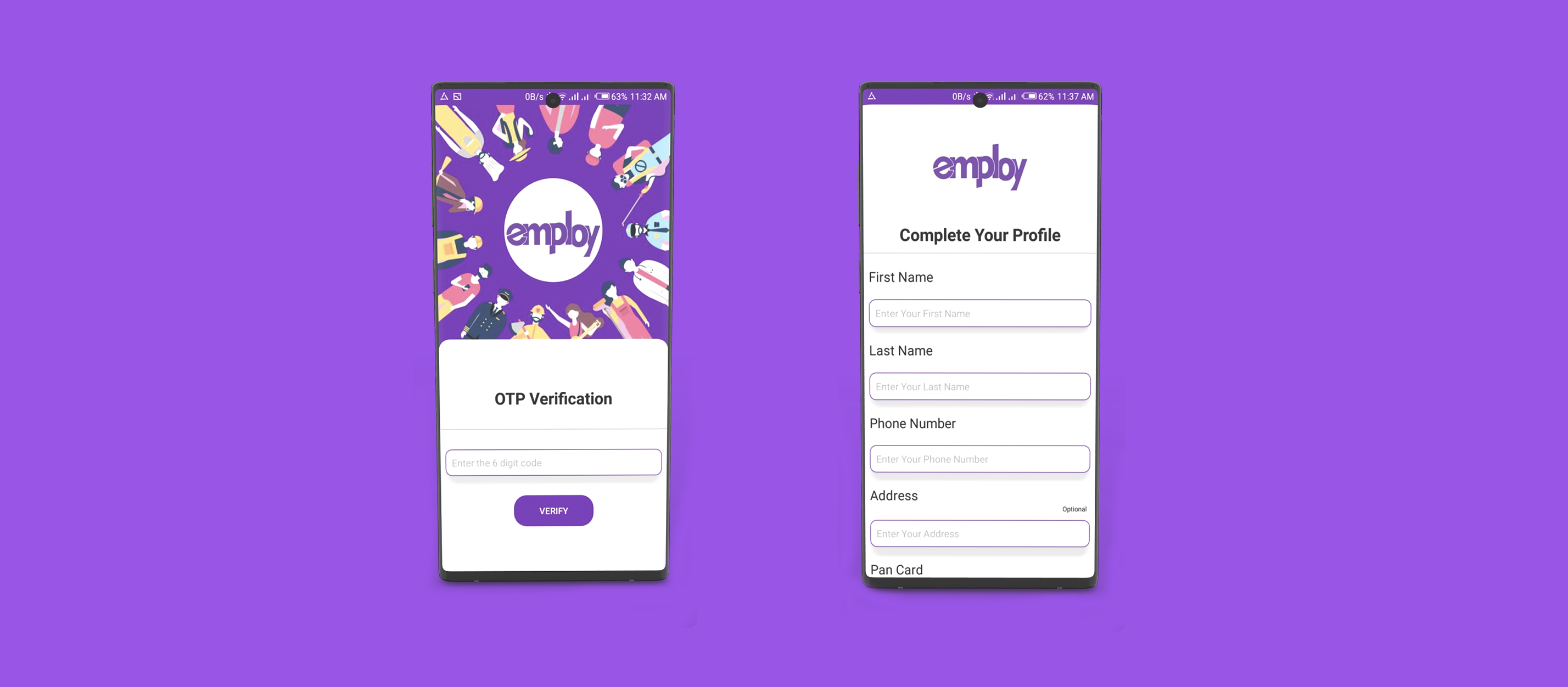
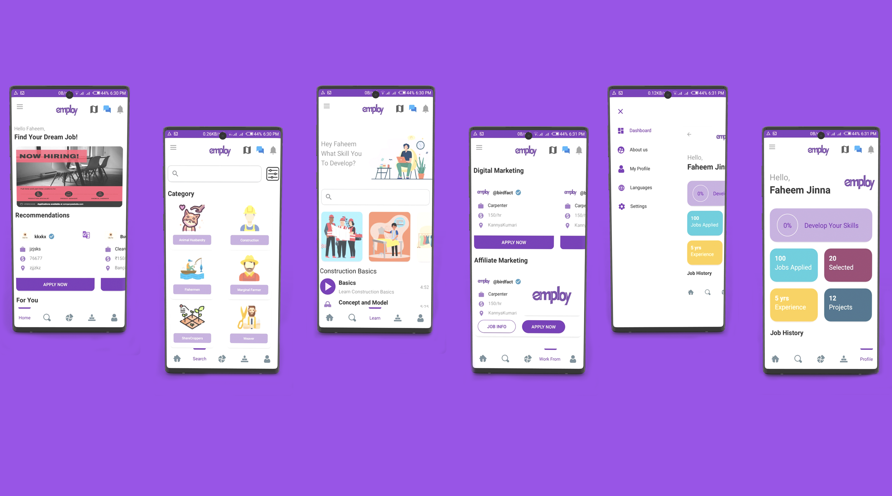
Proposed a design with fast access to significant sections (Home, Search, Learn, Work From Home, Profile) and made accessibility easy. and also proposed a one step login to make signup easy
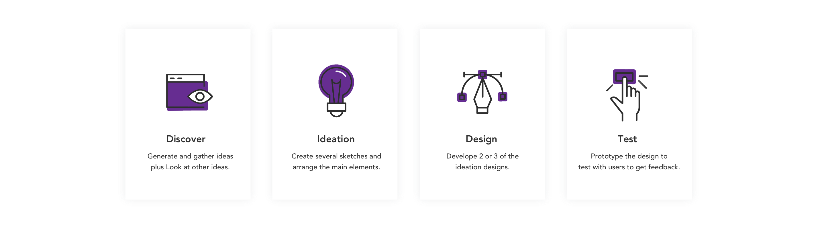
- Design principles: Double Diamond Framework.
- Home screen more personalized (Recently listed jobs, Popular jobs, Recommended work and Tutorials )
- Navigation and transition should be easily understandable.

GATHER IDEAS
Sketching and Wireframes
We had a list of screens to cover all scenarios so I started to sketching different designs to detail out the flows to discuss and share with team members to get feedback.

Laying the foundation
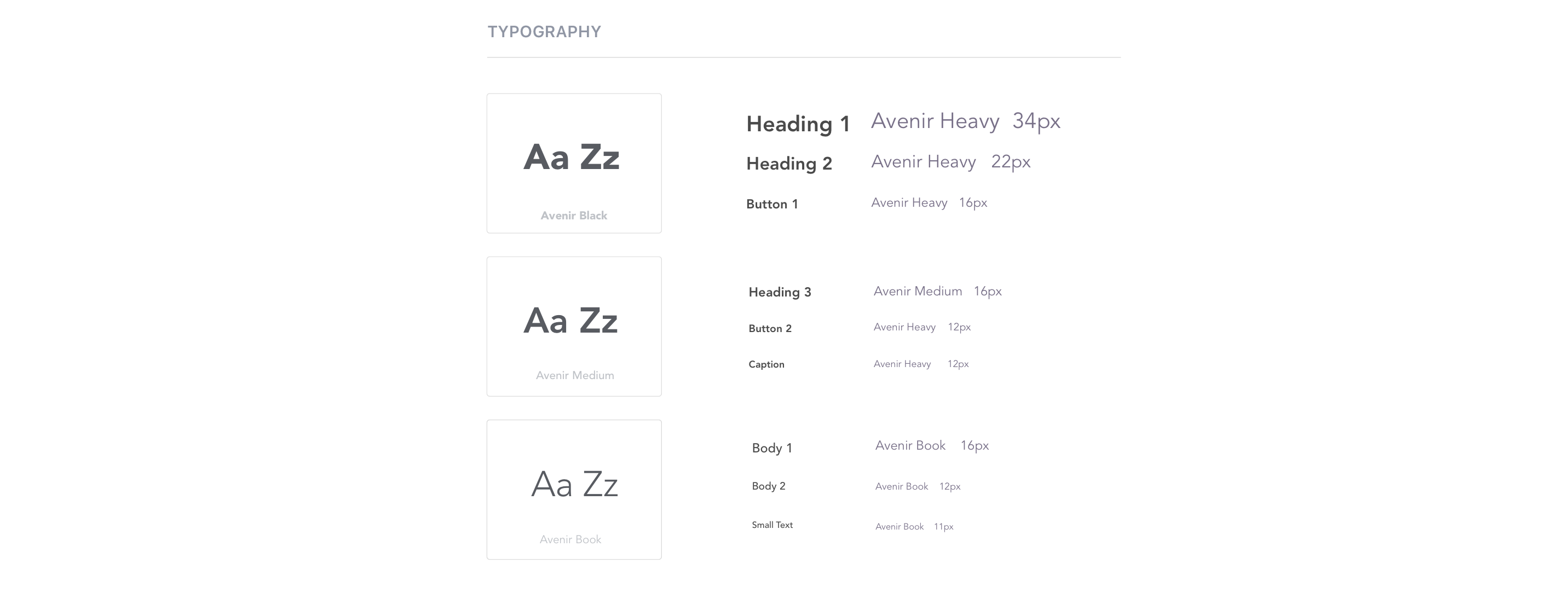
Crafting a Holistic Look and Feel
This is a style guide for Navaak's brand and mobile application. This style guide contains colors, typography, components, buttons, icons, and overlays.


GENERAL FLOWCHART
User Flows
As the saying goes, “A good start is half the battle." Before going into user interface design, I made sure to polish the features and user interaction flow.
The following feature flowcharts describe the content strategy and user flow through the app, listing potential features users may interact with. The creation of flowcharts are the basis for refining the workload necessary for developers and higher-fidelity designs later on, and for discovering potential issues behind the product in a quick and time-efficient way.

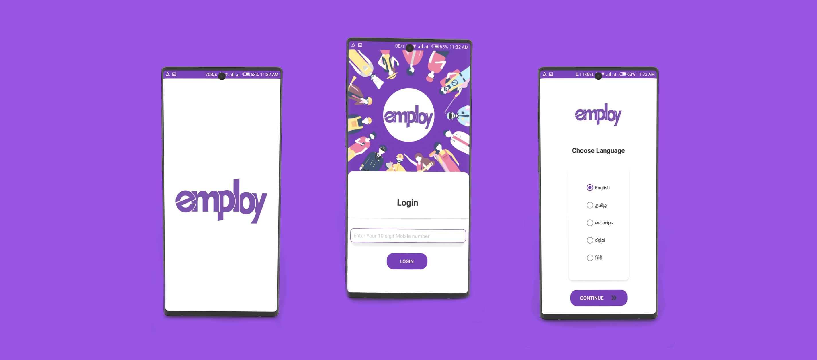
Splash and Onboarding
When the users opens the app, If he/she is new to the app they will be led through a onboarding process ,Sign in or sign up, before proceeding to their default screen, the Home screen, which houses a footer navbar. The navbar has five tab options:
Home — where users go to see and explore different jobs, companies and people.
Search — where users go to browse different jobs and companies.
Learn — where users can learn about new jobs and acquire new skills.
WFH — Where users can search for Work From Home Jobs.
Profile — where users go to view their public profile and settings.
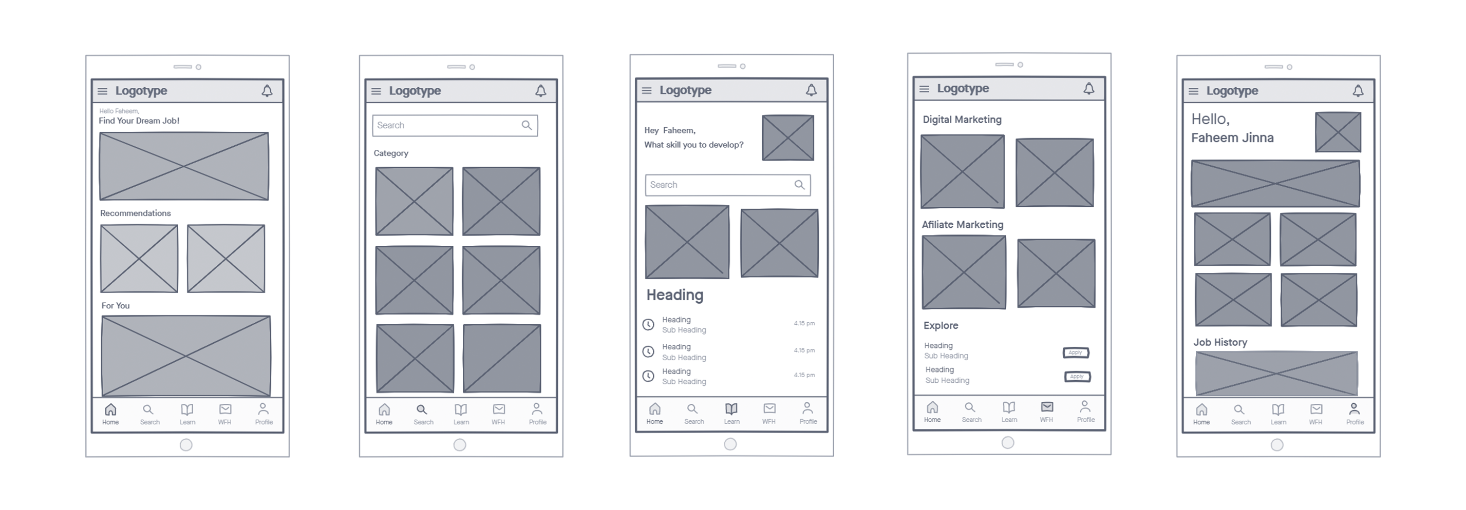
Home and Other Screens
Here I put some of the screens from the primary actions in this app. The Home Screen shows us the recommended and top rated jobs. The Search screen lists the types of jobs that the user searched by categorizing it. The Learn screen shows the types of tutorials in the app. The WFH screen lists the work from home opportunities from different domains. The Profile screen displays the user recent jobs and details.

What I have learned from this project?
- Simplicity is strength. As a designer, we are often lured by attractive, trendy and out of the box designs. But, We must always remember the ‘why’. The primary goal is to understand the user, their problems and then come up with a design that solves it.
- Process in essential. For a project that is vast, it gives you a roadmap to navigate through what can be a foggy route. This is especially useful when you’re starting out.